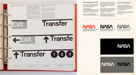
Pages from New York City Transit Authority Graphics Standards Manual & 1975 NASA Graphics Standards Manual
In graphic design history news: Check out Mary Alice Miller’s article on Vanity Fair about old graphic design manuals. In 2012, two designers found an original copy of the New York City Transit Authority “Graphics Standards Manual” by Massimo Vignelli and his design firm partner Bob Noorda. The two designers, Hamish Smyth and Jesse Reed, posted pages of the manual online and reprinted the book. They also reissued a copy of the 1975 NASA Graphics Standards Manual by Richard Danne and Bruce Blackburn. You can also read their story at Fast Company Design in an article by Meg Miller.
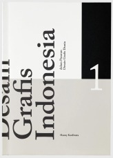
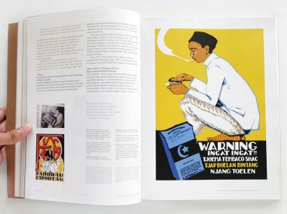
In graphic design history news (international edition): A new book has been released that studies the history of graphic design in Indonesia. Grafis Indonesia dalam Pusaran Desain Grafis Dunia (Indonesian Graphic Design within the Global Landscape of Graphic Design), written by graphic designer Hanny Kardinata, traces back to the 1900s and splits each decade into its own chapter. “Although the fields of graphic design and visual communication have become a trend in society, the development of graphic design in Indonesia has not been recorded properly,” a press release from the book’s publisher, DGI Press, said.
The book is available online for Rp 429,000 ($30.99).
Desain Grafis Indonesia details the history of graphic design in Indonesia
Adrian Frutiger was a world-renowned Swiss typographer who revolutionized type in the 20th and 21st centuries. He is one of the few typographers whose career spanned from hot metal to digital typesetting. At 16, he became an apprentice for the printer Otto Schlaeffli in Interlaken. He then studied at the School of Applied Arts (Kunstgewerbeschule) in Zurich. In 1952, he was recruited by Charles Peignot for the world’s leading type foundry, Debery & Peignot. At the time, the foundry was using a new phototypesetting process with the Lumitype and they wanted Frutiger to adapt typefaces for it as well as develop new ones. He developed several typefaces for Debery & Peignot including Président, Méridien, and Ondine, and he started working on his most recognized font family, Univers. Univers consisted of 21 variations and a new naming system. Instead of using the typical terms such as condensed, light, bold, or italic, Univers used a numbering system as well as a periodic table. Univers 55 was at the center with a typical “book” weight. Fonts to the left were expanded, fonts to the right were condensed. Fonts above 55 (with a lower number) had a lighter weight and fonts below 55 (with a higher number) were heavier. Even numbered fonts were italics and odd numbered ones were Roman. In addition to Univers, Frutiger is most well known for the typefaces Frutiger and Avenir. Frutiger, designed for the Charles de Gaulle airport in Paris, is perhaps the most internationally widespread of his fonts and can now be seen in airports all over the world. Adrian Frutiger designed over 40 typefaces and received numerous honros and awards including the 1987 medal of the Type Directors Club.
Sadly, Adrian Frutiger passed away last year at 87. You can read his obituary from Linotype, which details his life and legacy.
Univers periodic table, Adrian Frutiger, 1954
Frutiger in use at the Charles de Gaulle Airport, photo courtesy of 100besttypefaces
Egyptienne, Univers, Frutiger, and Avenir, Adrian Frutiger
Linotype Didot (contemporary adaptation of Didot), Adrian Frutiger, 1991
“When you go through this work, you see the evolution of art and design over 120 years—the different styles, the different techniques.”
In graphic design history news (is that such a thing?): two Canadian designers, Ben Hulse and Greg Durrell, have compiled, digitized, and edited all past Olympic graphics including pictograms, mascots, and logos into a catalogue of brand marks. They and the International Olympic Committee hope to sell the past Olympic brands on clothing and other souvenirs. The Olympic Heritage collection is not for sale yet, but they are currently trying to get it licensed across the IOC’s national territories. Check out Michael McCullough’s article on Canadian Business for details on their process, it’s a great read!
A duffle bag with the 1956 Olympic logo
Notebooks with the logos from 1932, 1968, and 1984 Olympics
Hulse and Durrell looked at 25,000 different items to make sure every design was historically correct
In graphic design history news: In 1969, Saul Bass gave a pitch to Bell Telephone (now AT&T) to completely rebrand the company, and it’s pretty amazing. The beginning of the video is about how the world was changing in the 60s, so the Bell Telephone needs to keep up. He goes through different types of logos and compares some of the updated logos from other top companies. The breakdown of how the Bell logo was created starts at around 11:15, and the attention to detail is fascinating. His plan for the corporate rebrand included ideas for vans, trucks, uniforms, phone booths, and even jewelry. Obviously the pitch worked and the Bell logo was used until 1984 when the company became AT&T, whose logo Saul Bass also designed. The pitch is 27 minutes long, but well worth watching.
The original Bell logo (left) and the redesigned logo, Saul Bass (right)
Floppy disk containing a custom designed font for Prince.
In 1993, Prince changed his name out of frustration with his record label to a symbol called The Love Symbol. In order for the press to be able to write about him, Warner Bros sent out floppy disks with a custom designed font containing The Love Symbol.
In graphic design history news: There’s a new documentary, Graphic Means: A History of Graphic Design Production, coming out in 2017 that explores graphic design and the huge changes the industry went through from the 50s through the 90s. The film, directed by Briar Levit, features interviews with notable figures of graphic design including Ellen Lupton, Tobias Frere-Jones, Ian Swift, and Adrian Shaughnessy. It’s a more in depth look at how design was done by hand before design software (similar to the video from Lynda posted a couple weeks ago) and how new technologies changed the design process.
Watch the trailer below and check out the official website for more information and updates.
A.M. Cassandre (born Adolphe Jean-Marie Mouron) was a Ukrainian-French painter, poster artist, and typeface designer. He studied at the École des Beaux-Arts and at the Académie Julian and began his career at age 22 designing posters for a printing firm. One of his earliest commissions was the poster, Au Bucheron, for a cabinetmaker, which won first prize at the Exposition Internationale des Arts Décoratifs in 1925. He was known for his combination of Cubism and Purism, which was shown in the innovation in his posters and use of two-dimensionality, geometric forms, broad planes of color, inventive use of type and letterforms, and dramatic imagery. His works often emphasized size and scale with larger than life images. His most known poster, Normandie, emphasized the size of the ship with art deco lines and perspective as well as using a small French flag and tiny birds to highlight the scale. He created posters for other companies including the Parisian newspaper L’Intransigeant, railways, ocean liners, and liqueur. He also created several typefaces: the art deco Bifur, Acier, the new-Roman Peignot, and his last, Cassandre. In the late 1930s, Cassandre worked for Harper’s Bazaar on the magazine’s covers and continued painting.His later career involved set and costume design in theatre and the logo for Yves Saint Laurent in 1963, which is still in use today on accessories and cosmetics.
If you like vintage labels, there’s a huge collection of Vintage Beer Labels at Flickr, courtesy of the Thomas Fisher Rare Book Library, University of Toronto. There are some really great ones including one from Stag’s Head with, well, a stag’s head on the label; a great old Budweiser label from the early 1930s (Canadian Budweiser, but it’s ok); and a cheery Perth Brewery label with a cute puppy on the logo (maybe I just like the dog).
Stag’s Head Lager Beer, c.1906-1956
Perth Brewery Old Stock Ale, c.1928-1949
Budweiser Brewing Company of Canada Limited, c.1929-1932
Other standouts include Regal with great gold and purple colors and, my favorite, Capital Ale Old Stock.
Regal by Taylor And Bate Limited c.1930-1937
Capital Ale by The Capital Brewing Co. Limited, c.1899-1944
(Does the label for Carling’s White Eagle Lager remind anyone else of the Land O’ Lakes butter label?) Check out all of the great old labels on Flickr. Thanks, Canada!
Nini Pattes de L’Air poster from Moulin Rouge!, Silvana Azzi Heras, 2001
The 2001 film, Moulin Rouge!, is set in 1909, right at the tail end of the art nouveau movement. The movie, like all of director Baz Luhrmann’s movies, is rich in detail, color, and design. While the music was made up of mostly contemporary songs, the posters created for the movie were designed to fit in with the art nouveau style. At least a few of the original posters were made in the style of Henri Toulouse-Lautrec (which makes sense since Henri Marie Raymond de Toulouse-Lautrec-Mooonnnfa is a character in the movie). In fact, Toulouse-Lautrec’s poster, “La Troupe De Mlle Eglantine”, is painted on the side of the Moulin Rouge offices. The Absinthe Silvana poster looks like an early version of an Alphonse Mucha poster. See the rest of the original Moulin Rouge! posters, designed by graphic designer Silvana Azzi Heras, below.
La Troupe De Mlle Eglantine, Henri Toulouse-Lautrec, 1895
Building with La Troupe de Mademoiselle Eglantine painted from Moulin Rogue!, 2001
Diamant Brillant poster from Moulin Rouge!, Silvana Azzi Heras, 2001
Chocolat Au Moulin Rogue poster from Moulin Rouge!, Silvana Azzi Heras, 2001
Absinthe Silvana poster from Moulin Rogue, Silvana Azzi Heras, 2001
Spectaculaire, Spectaculaireposter from Moulin Rogue!, Silvana Azzi Heras, 2001
All MR! images courtesy of the Moulin Rouge! DVD (which is why the quality isn’t the best)